Problem/Concept
The design concept is to create a product that can provide service to both grocery store employees and ˇ®too good to goˇŻ app users (customers). We got inspiration from self service Parcel Boxes that are used in the post office.
We were inspired to create a self-service box system that can help to release the store  employee from fetching the ˇ®magic bagˇŻ and reduce customersˇŻ waiting time. This can help to reduce at least one task for store employees in their hectic working days and provide customers a better user experience as well. With decorations on the box, we can also advertise for the app so that more people join in this movement to fight food waste.
Target group
After much deliberation we have decided that grocery store employees will be an excellent target group for this particular study due to several reasons:
-
Their knowledge of the The too Good to Go process: what needs to be done, before, during, and after a customer arrives
-
Their dual insight into being both a Too Good to Go customer and a grocery store employee
-
Their knowledge and insight gives a contextual image of food waste in grocery stores that touches on different interest groups from the store itself, to the employees, to the customers
-
They are easily available to us because one of our team members work at Coop Mega. This means the research we will be conducting will specifically be with Coop Mega employees. We are not sure yet if we should interview grocery store employees from other chains as well.
Research Methods
We have conducted four interviews in person before the COVID-19 restrictions were put into place. All our interviews were semi-structured with both closed and open ended questions. After the first pilot interview we tweaked our interview guide to include a few more pertinent questions and we realized that we shouldnˇŻt rush the intro/outro of the interview. We also were happy to learn how much easier it is conducting an interview when one person asks the questions, while a second person takes notes and handles the audio recording. We will therefore use this two-people model in our upcoming interview.
Post COVID-19 restrictions we had four more interviews over Skype. We still asked all the questions on our interview guide and our participants answered most of them. Later when we reflected on the interviews we had on skype, we noticed that our 4 participants were relatively quiet during the interview via skype and participants seem to be more talkative when we had an interview face to face before Covid-19. Also one of our participants did not open the camera when we did the interview, it was a little hard as we can not see the facial expressions and reactions. We are mindful of the fact that how we conduct interviews and the environmental changes and the whole situation of Covid-19 definitely have an impact on our data.
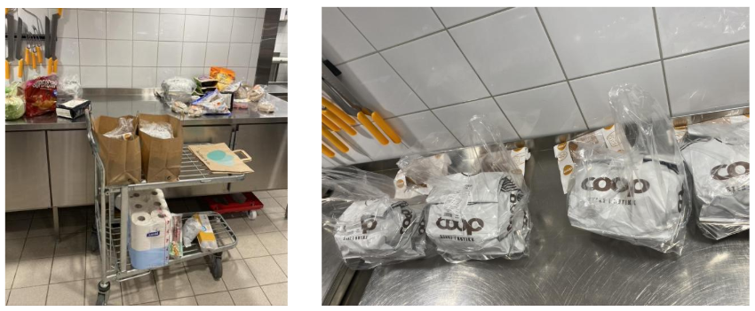
We also had one round of onsite observation at the store and took onsite notes and later used our notes for further analysis. These notes were vital to understand the practical issues related to the Too Good to Go service. For example, the dimensions of the Too Good to Go bags mattered a great deal in our final high fidelity prototype.

Prototypes/Design
Iteration 1: Storyboard and sketches
In iteration 1 we focused  on the concept of the prototype and worked with our target group to figure out which direction to take our project. We had two other ideas apart from the self-service box idea. Through A/B testing and interviews we concluded to move forward with the self-service box you see in the sketch above.
During the first prototype iterations we created low-fidelity prototypes based on our research. We started with a storyboard, which shows the  process of the service and our tangible user interface(TUIs), employees put the magic bag in the box, customers use code to open the box and bring home the food. We want this box to be used both by the employees and by the customers. and then moved to sketching the prototype on paper.
Iteration 2: Blender and Arduino
 In the second iteration, our team member Yan learned Blender to bring our sketches to life so we could focus on the form of the prototype - as you can see in the following pictures.

This is also when we started working with Arduino and how we could implement our ideas into a physical prototype.
Iteration 3: Blender Video and Arduino Number Pad
In the third iteration we worked on the function of our prototype and further developed our blender prototype to a full fledged high-fidelity video. With feedback from our target group we added a number pad as a lock mechanism and honed in on the usability of the box. Through this iteration we realized our box was too small as the Too Good To Go bags would not fit in the box we used from iteration 2.

Iteration 4: Final Prototype

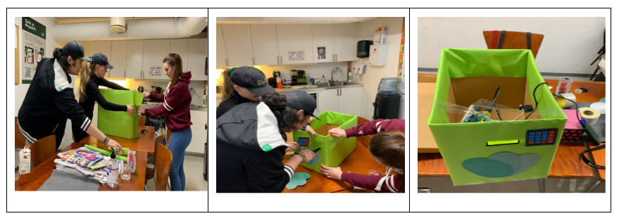
In our fourth iteration, we tried to make changes according to the feedback we received from our users (such as increasing the box's size) and also tried to integrate ˇ®look and feelˇŻ, ˇ®roleˇŻ, and ˇ®implementationˇŻ together.
We made the final prototype as shown above It is working and powered by a power bank. We made holes on cardboard to place the numpad and the LCD screen. The lock is inside the lid. We decorate the box with green wrapping and added the Too Good To Go logo.
The following picture shows our Arduino circuit for the final prototype.

